Top Data Visualization Tools for Effective Marketing Dashboards
September 12, 2025 | by qqvmedia.com
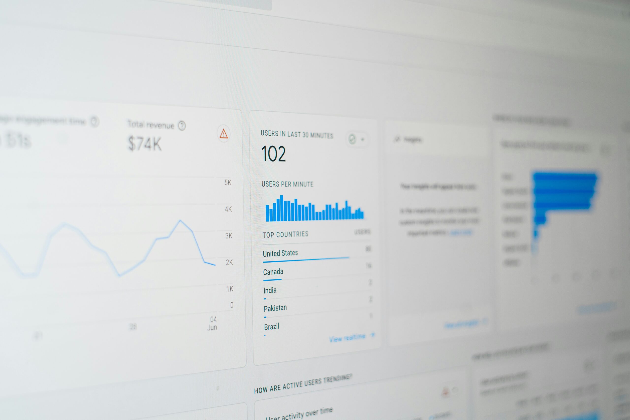
Introduction to Data Visualization in Marketing
Data visualization is a crucial component of modern marketing that transforms complex sets of data into visually engaging formats. By leveraging various visual elements, such as charts, graphs, and dashboards, marketers can simplify intricate information, making it easier to analyze and comprehend. This process is essential for extracting meaningful insights from vast amounts of data, ultimately enhancing strategic decision-making.
In today’s fast-paced marketing landscape, the ability to quickly interpret data is paramount. Data visualization tools allow marketers to present metrics and key performance indicators (KPIs) in a way that is accessible and digestible for diverse audiences. For example, stakeholders who may not have technical expertise can grasp complex data easily, enabling more informed discussions and collaborations. As a result, effective communication of insights becomes attainable, fostering a more agile approach to marketing strategies.
Moreover, visual representations of data help identify trends and patterns that may be overlooked in traditional analysis. By utilizing heat maps, bar charts, and line graphs, marketers can visually analyze consumer behavior, market dynamics, and campaign performance. Such visualization leads to enhanced foresight, enabling marketers to anticipate changes and adapt their strategies accordingly. This proactive approach is fundamental in maintaining a competitive edge in an ever-evolving market.
Furthermore, the integration of interactive visualization tools can significantly enhance user engagement. Interactive dashboards can allow end-users, including clients and team members, to filter data according to their interests, making exploration intuitive. By harnessing these insights, marketers can refine their campaigns and target their audiences more effectively. Overall, data visualization serves as an essential bridge between complex data analytics and practical marketing application, contributing significantly to the effectiveness of marketing strategies.
Key Features to Look for in Data Visualization Tools
When selecting a data visualization tool for effective marketing dashboards, several key features should be meticulously considered to ensure that the chosen solution aligns with user needs and organizational goals. One of the primary aspects to evaluate is the ease of use. A user-friendly interface is crucial; it allows team members of varying technical expertise to efficiently create, modify, and interpret dashboards without extensive training. The level of intuitive design can significantly impact the tool’s adoption and overall effectiveness.
Another important feature is the integration capabilities with existing data sources. A potent data visualization tool must seamlessly connect with various data platforms, including CRM systems, social media analytics, and databases, allowing marketers to consolidate their data for comprehensive insights. This integration ensures that users can easily retrieve and analyze data from multiple sources, enhancing the depth of the visualizations.
Moreover, a diverse variety of visualization options is essential. Marketers should look for tools that offer an array of charts, graphs, maps, and other visualization types. This variety enables users to present data in the most suitable format for their specific audience, thus enhancing the communication of insights. Real-time data updates are also critical; a tool that provides ongoing analytics allows marketing teams to respond promptly to changes and trends in their campaigns.
Collaboration features are equally vital, particularly for teams that require shared insights. Tools that facilitate easy team sharing and joint editing ensure that all stakeholders are aligned and can contribute to the dashboard in real-time. Lastly, flexibility in customization options can strengthen brand identity. The ability to tailor visuals—such as color schemes, logos, and other design elements—ensures that the dashboards reflect an organization’s branding while effectively conveying data.
Top Data Visualization Tools for Marketing Dashboards
Effective marketing dashboards require robust data visualization tools that can transform complex data sets into insightful and actionable visuals. This section highlights some of the leading data visualization tools available today, each tailored to meet various marketing needs and budgets.
Tableau stands out as a powerful tool for data visualization, known for its ability to handle large data sets and deliver compelling, interactive dashboards. With features such as drag-and-drop functionality, real-time data analytics, and seamless integration with various data sources, Tableau allows marketers to create customized visualizations that cater to their specific requirements. However, its pricing can be on the higher side, making it more suitable for larger enterprises with substantial budgeting capacities.
Google Data Studio is a cost-effective solution perfect for small to medium-sized businesses. This free tool offers a user-friendly interface and a multitude of templates to simplify the dashboard creation process. Marketers can easily connect to Google Analytics, Google Ads, and other relevant data sources to visualize their marketing campaigns’ performance. Its collaborative features allow teams to work simultaneously, making it an excellent choice for collaborative environments.
Microsoft Power BI is another noteworthy option, particularly popular among organizations already utilizing the Microsoft ecosystem. With its integration with Excel and other Microsoft tools, Power BI allows for easy data manipulation and visualization. It supports a variety of data sources and offers extensive features such as real-time dashboard updates and mobile accessibility. While it is relatively affordable, it provides flexibility capable of meeting various marketing needs.
Other notable tools include Qlik Sense, renowned for its associative data modeling, and Looker, which focuses on providing data exploration capabilities to improve decision-making processes. Each of these tools comes with unique features and pricing models, which enables marketers to select the one that best aligns with their analytical requirements and budget considerations.
Best Practices for Implementing Data Visualization in Marketing Dashboards
Implementing effective data visualization in marketing dashboards requires a thoughtful approach to ensure that the presented information accurately conveys insights and facilitates decision-making. One of the pivotal best practices is selecting the right metrics to visualize. Marketing professionals should focus on key performance indicators (KPIs) that directly align with business objectives. Metrics such as conversion rates, customer acquisition costs, and engagement scores provide valuable insights that can be effectively visualized to monitor performance.
Furthermore, the importance of maintaining clarity and simplicity in design cannot be overstated. A cluttered dashboard can overwhelm users, making it difficult to extract meaningful information. By leveraging white space and organizing visual elements, practitioners can promote easier navigation and comprehension. Charts and graphs should be straightforward and intuitive, ensuring that stakeholders can quickly grasp the underlying trends and patterns.
Effective use of color and typography also plays a significant role in the success of data visualization. Colors should be chosen strategically to differentiate between data sets while providing visual harmony. Moreover, typography ought to be legible, with appropriate font sizes that enhance readability without compromising aesthetic appeal. Consistency in design elements fosters familiarity and ease of use, contributing to a positive user experience.
Another crucial aspect is storytelling with data. Professionals should strive to weave a narrative around the visualized data, guiding stakeholders through the insights and fostering engagement. This narrative approach transforms raw numbers into compelling stories, making it easier for decision-makers to connect the data with actionable outcomes.
Finally, continuous improvement and adaptation of marketing dashboards are essential. Encouraging regular feedback from users can identify potential enhancement areas and ensure that the dashboard evolves with changing requirements. By incorporating user suggestions and staying attuned to industry trends, organizations can maintain relevance and maximize the effectiveness of their marketing data visualization strategies.
RELATED POSTS
View all

Unlocking the Power of Whiteboard Animation in Video Marketing
September 23, 2025 | by qqvmedia.com

The Rise of the Mobile-Only Rule: Why Your Strategy Needs to Shift
November 11, 2025 | by qqvmedia.com
